Matching Colors to Repair Clock Faces
by John B. Lord Sr.
Suppose that the face of one of your clocks has been damaged, scratched, maybe, or dried and checked and flaking, or worn where you wind it, or something of the sort. Suppose that you have decided that the damage is sufficiently ugly that you would like to repair it but don't know how to start. (Left out of consideration is the question of how important the clock may be and whether you are willing to paint over the damage. I assume that you have already made that decision.)
So how do you begin? What color are you trying to match? It just looks off-white to you, and you are quite right. It IS off-white. But how far off? And ill what direction? These are two of the questions for which I hope to supply answers. The third question is, of course, "How do I mix the color to match this particular off-whiteness?"
After we have understood the theory which underlies these answers, one more question will surely arise: What does one do about patina? Part of the patina is just plain dirta thin layer of more or less evenly distributed dirt which has accumulated over the years and which no evenly distributed paint will match exactly. This can be washed off. Several commercial preparations are available, and, of course, this washing must be done before any painting. But a distinct patina will probably remaina discoloration of the paint that happens over time, or perhaps some ingrained dirt, or some other cause. Later I will offer a few suggestions which have worked in the past pretty satisfactorily.
To begin, I must make an important distinction. When I say "color," I mean paint–tubes cakes of pigment. When a physicist says "color," he means light–a particular wavelength of the visible spectrum running from infra-red to ultra-violet and seen by all of us in the rainbow. It appears to us to be divided into pretty distinct bands of color: red, orange, yellow, green, blue, violet, but, of course, the wavelengths do not shift so abruptly as all that. The shifts are extremely minute, but our eyes see the groups which our culture has conditioned us to see, and we list them accordingly. Not all cultures divide the rainbow in the same way.
This distinction between color as light and color as pigment may seem very academic, but it brings with it some very practical matters, fundamental to the mixing of paints. For a physicist, white light is all the separate colors of the rainbow put back together again into the white light of the sun. When a painter, and we are becoming painters in this problem, mixes colors (pigments) all together, he gets black–just the opposite of what the physicist gets. Correspondingly, for the painter, white is simply the absence of color. But for a physicist, no colors at all, that is, the absence of light, is black. The physicist deals directly with light but we deal with reflected light–the light which is reflected to our eyes from the pigment– and these two matters differ oppositely.
Finally, the physicist thinks of color as beginning at the low end of the visible wavelengths, continuing through them, and coming out at the top end of visibility and fading off into the other and higher waves which we cannot see. We, however, will not think of pigment in this way. Instead, it will be convenient to think of pigments as curling the visible colors into a circle so that red curves into orange and then yellow and so on until it reaches to violet and purple and then again into red, completing the circle.
Here is a much simplified color circle. (circle divided into thirds, with red, yellow and blue segments)
It shows only three colors: red, yellow, and blue. These are called the three primary colors because it is not possible to make them by mixing together other colors. No matter what combinations of pigment we put together, we won't be able to mix a red, a yellow, or a blue. We must have them to begin with. But by mixing various combinations of red, yellow and blue we can get any color we want.
Now that's theory. It works in practice, too, but remember that we will be dealing with only three pigments, and remember, too, that these pigments are not pure things, like rays of light at particular wavelengths, but mixtures of various, more or less pure chemicals, and consequently, we will learn eventually to modify the simple elements in order to achieve ever subtler distinctions. Just the same, starting with these three we will be able to achieve a very high degree of accuracy, and will learn enough to go ahead on our own.
We will want acrylic pigments. For red, I like, "Grumbacher Red," so-called because Grumbacher is the company that makes it. There are, obviously, many shades of red, but this shade is the one that comes to my mind when the word is spoken. Similarly, the yellow I have used is a cadmium yellow medium and is made by many companies under that name. The blue which I have used is made by Binney and Smith under their trade name for paints, "Liquitex," and is called Brilliant Blue. You may prefer a different set of colors. It's a matter of what each person means when each color is named. If you use different brands or different shades, your results will differ a little, but the theory will still work. These pigments, however, are easy to get and to use, with one or two possible exceptions which we will comment on when we get to them.
The question comes up, "Why do we use acrylic paint?" There are, after all, other possibilities: oil, tempera, and transparent water color. Tempera and water color are too easily damaged, especially by moisture and sunlight. Oil paint is very durable indeed, and expert hands would probably do this job very well. It is more difficult to learn, however, and uses much turpentine, which can easily cause some damage. For these reasons I recommend acrylic: It is easy to clean mistakes with a damp cloth, but do so quickly or it will dry and harden. Dry, the finish is durable and less glossy than oil paint. A high gloss is not usually desirable on clock faces.
Now to the secondary colors? orange, green, and purple. Orange goes between red and yellow, green between yellow and blue, and purple between red and blue. Orange is between red and yellow because if we mix red and yellow we get orange. Of course, if we use a lot of red and not much yellow, we will get reddish orange; similarly, emphasis on yellow gives us a yellowish orange. The same is true of the other secondaries. Green is half yellow and half blue. Purple is half blue and half red. This diagram shows the circle of these colors:
(color circle with red, orange, yellow, green, blue, and purple)
Our purple will be very dark almost black. With a different blue or a different red, we would get a different purple, of course, but we can work with this one. There are two ways of lightening it. First we need to discuss the idea in terms of VALUEthe relative darkness and lightness of colors. To lighten a color, we may either dilute it with water or add some white. The results are similar but not identical. In practice, try both and see which works better in the problem you are working on. Practice both methods, working with each of the secondaries, one after the other. So much for lightening the shades; now for the reversedarkening them.
Two new terms are needed: "complementary color," and "greying." To explain the first term, we return to the three primaries, red, yellow and blue, and the three secondaries, orange, green and purple. Look back at the diagram of their positions in the full circle. The complement of any color is that color which appears directly opposite to it in the circle. Consider green. What is opposite? Red. Why is it called complementary? Because green is made up of yellow and blue, and red completes the primary circle. Correspondingly, the complement of red is green, for red and green complement each other.
What complements blue? Which primaries have been omitted? Clearly, red and yellow. These two make up orange, which complements blue and, therefore, appears exactly opposite to blue on the circle. What complements purple? Purple is made of red and blue so the remaining primary must complement it, that is, yellow, which appears in the circle directly opposite purple. This relationship will continue even on more detailed color circles, as we will soon see. It is, therefore, always easy to determine the complement of any color if you have an appropriately detailed circle. At the end of this article is a set of detailed directions for making one.
The other term is "greying." Remember that if we mix all your pigments together, we get black. If we mix red and yellow to make orange and then add its complement, blue, we get blackthat is, if we add them each in the right shade and proportion. But if to your orange we add a very small amount of blue, we dull the orange slightly, turning it gently toward grey. The more blue we add, the more sombre it will get. Eventually we will end up, not with black (we won't get the proportions or shades quite right) but with a greyed blue, if we have added enough. And now we come to very practical matters: the actual painting of a clock face.
What color is a clock face? As we decided some time ago, it is a sort of off-white. Now we are in a position to determine in which direction it is off. There are only three main directions: red, yellow, and blue; three sub-directions: orange, green, and purple. I have studied several hundred clock faces, and I have learned what seems to me to be a very curious fact: All painted clock facesI do not now consider faces made of any unpainted metal, or of enamel or porcelain, or any face at all, other than the usual painted faceall such faces that I have seen are painted in one of three colors: they are pale, greyed orange; or pale, greyed green; or pale, greyed purple. That last is the least commonly found. I have not kept a careful count, but my impression is that about 47% are orange, 47% are green, and the remaining 6% are purple, or, since these colors have all been made pale, call the purple violet or lavender. Why this should be, I don't know. Perhaps because the primaries seemed too simple.
Examine a clock face now. Look at the color very critically in the light of what we have just learned of color. It is off-white, of course, but now we should be able to see the shade more distinctly. If this is still difficult, there are other ways to tell, and we will get to them soon. It may well be that variants of clock dial colors other than the three I have mentioned are to be found. If you find one and wish to repair any damage to it, then you will know how to go about it. I have one more item to discuss; it will bring about that happy conclusion.
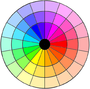
At right is a blank but potentially much more nearly complete color circle. It is black in the center. On a true color circle, and radiating out from the center, will be all of the colors we have discussed so far, but each of them is divided into three parts radially and three parts in increasing circumference from the black center. The inmost yellow, in the midst of the yellows, will be our old acquaintance, cadmium yellow medium. To the left will be a section of reddish yellow, and to the right, a section of greenish yellow.
In the second circle from the center will be a series in which each color will have been greyed by an addition of a small dab of its complement. The outer circle will consist of dilutions by water of the greyed circle. These colors will be very much those which you will find on clock facesespecially at orange, green and purple.
Each section of this chart is numbered, and for each number there is a set of directions for mixing the color that goes with it. Follow the directions and make your own detailed color circle.
I do not recommend that you paint directly on the chart shown here. First, this paper is not suitable for painting. Go to an art supply store and buy a proper sheet. The clerk will know what you need and can advise you as to brushes, paint, and perhaps a palette. Instead of a palette, I find it more practical to buy a package of small, throwaway paper saucers, about six inches in diameter, with an impermeable, high-gloss finish. Mix colors on them and discard them when you are done.
Second, you may very well wish to make more than one attempt at this, and you will want to keep the numbers clear and readable, so copy the chart onto the paper you have purchased, and don't spoil your copy of the BULLETIN.
You will need two to four hours to finish the job, assuming that all goes well. After you have finished, you will have learned a new skill and made a record of it that will last. There is no learning like hands-on learning.
You may wish to cut out and label (on the back) each segment of color with the recipe for its mix. Then, when you start to repair a damaged clock face, you can hold up a sample against the color on the face in order to begin your first approximation.
Suppose that you have matched the clock face color as closely as you can but still without full satisfaction. The clock face probably has a patina. What do you do when you just can't quite match that patination?
Here is your last trick: get small tubes of these paints: raw sienna, burnt sienna, raw umber, and burnt umber. With a small, damp cloth, rub a minute amount over the dried, newly painted surface. First make four sample rubbings on separate pieces of paper and compare them with the patina. Choose the best match, or modify your choice by mixing various combinations of these pigments. The process is called "antiquing," and with a bit of practice you can match a patina very satisfactorily. Remember to apply it thinly and uniformly. It takes a bit of practice, but you'll get it.
COLOR CIRCLE
DIRECTIONS
Get a suitable grade of paper at an art store. Do not paint directly on the numbered guide, as you do not want to lose the guide numbers. Copy the guide on the paper. Any acrylic cadmium yellow medium will do very well, and any titanium white, but I think it's easier to dilute with water, and certainly cheaper. I like Grumbacher RED and Liquitex BRIGHT BLUE, but suit yourself. You will know more about suiting yourself after you have tried these to start, however.
The guide, as you see, is numbered. The numbered directions which follow correspond to the numbers on the guide. You may find it easiest to paint around the inner circle first; then the second circle; followed by the outer circle, or to start with red and its complement, green, going on around the circle by doing a color and its complement together.
(Note: Rather than convert yet another color wheel to html and add to your down load time, I will describe the segment numbering scheme Jack used. Starting at the pure red segment, called one. and radiating outward, for segments two and three, then proceed clockwise. Just under the red segment is segment four, radiating outward again for segments five and six.)
1. Red
2. One red + dab of 28
3. Two, diluted with water. (After painting wet, diluted paint, dry brush on rag and blot excess paint with brush.)
4. Three red + 1 yellow
5. Same + dab of 31
6. Dilute 5 with water, blot excess with dried brush.
7. Two red + 1 yellow
8. Same + dab of 34
9. Dilute 8 as above.
10. One red + 1 yellow
11. Same + dab of 37
12. Dilute as above.
13. One red + 2 yellow
14. Same + dab of 4
15. Dilute as above.
16. One red + 3 yellow
17. Same + dab of 43
18. Dilute as above.
19. Yellow
20. Same + dab of 46
21. Dilute as above.
22. Three yellow + 1 blue
23. Same + dab of 49
24. Dilute as above.
25. Two yellow + 1 blue
26. Same + dab of 52
27. Dilute as above.
28. One blue + 1 yellow
29. Same + dab of 1
30. Dilute as above.
31. Two blue + 1 yellow
32. Same + dab of 4
33. Dilute as above.
34. Three blue + 1 yellow
35. Same + dab of 7
36. Dilute as above.
37. Blue
38. Same + dab of 10
39. Dilute as above.
40. Three blue + 1 red
41. Same + dab of 13
42. Dilute as above.
43. Two blue + 1 red
44. Same + dab of 16
45. Dilute as above.
46. One blue + 1 red
47. Same + dab of 19
48. Dilute as above.
49. Three blue + 1 red
50. Same + dab of 22
51. Dilute as above.
52. Two red + 1 blue
53. Same + dab of 25
54. Dilute as above.
This article first appeared in the June 1997 NAWCC Bulletin, published by the National Association of Watch and Clock Collectors, Inc., 514 Poplar St., Columbia, PA l7512.
About the Author
John Lord and his wife are both retired college professors. John says that she is the knowledgeable horologist of the family, and he aids and abets and chauffeurs. "I can tell at once a tall case clock from an hour glass, or even a wristwatch, and I can tell time. Beyond that, all horology is a mystery," he says. However, both belong to the NAWCC, and he has contributed a slide program on art deco and art nouveau to the NAWCC collection of programs.
Obituary:
The world became a slightly less cheerful place with the passing on Sunday, November 24th, 2002 of John Bigelow Lord Sr. A retired Professor of English at Washington State University and of late, Lacey, Washington, he is remembered by those of us who loved him as a lover of language, biblical scholar, and willing Professor of Shakespeare. Foremost among his other talents and hobbies, he was a bountiful baker of bread, artful embroiderer extarodinare, watcher of birds, fabricator of fabulous fudge, lithe tongued limerist, beloved father, and fine friend.
Born March, 3 1917, he is survived by his wife of 42 years, Elizabeth Lord, two brothers, eight children, eight grand children, and two great grand children.
He will be missed by us all.
This article was prepared by my step-father, in support of my mother who restores antique clocks and watches. The article was published in the National Association of Watch and Clock Collectors Inc. Bulletin, June 1997. The article was unable to faithfully reproduce the colors because of the imperfect color print process. I used Photoshop and the HSB color model to get the "exact" colors for the color wheel. I used steps of 30% to lighten the outer circles.
I use this wheel to restore various colors on my pinball machines.